how_should_we_initially_track_multiple_teams_progress
Table of Contents
How Should We Initially Track Multiple Team's Progress?
Sometimes you kick off a couple of teams at the same time, and want to see how the team's are doing over time. I've found this spreadsheet will help in those situations.
Sample Output
The spreadsheet shows a team by team view with a chart showing committed versus actual velocity over time, including an “acceptable range” band:
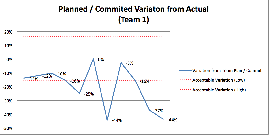
The idea is that you don't want the team to always hit the commitment (that just leads to “sand-bagging”) but rather want to encourage teams to take risks and not feel too bad when it doesn't work out, but also isn't way off. I've used plus / minus 16% as the acceptable range (based on reading) and found that to work well.
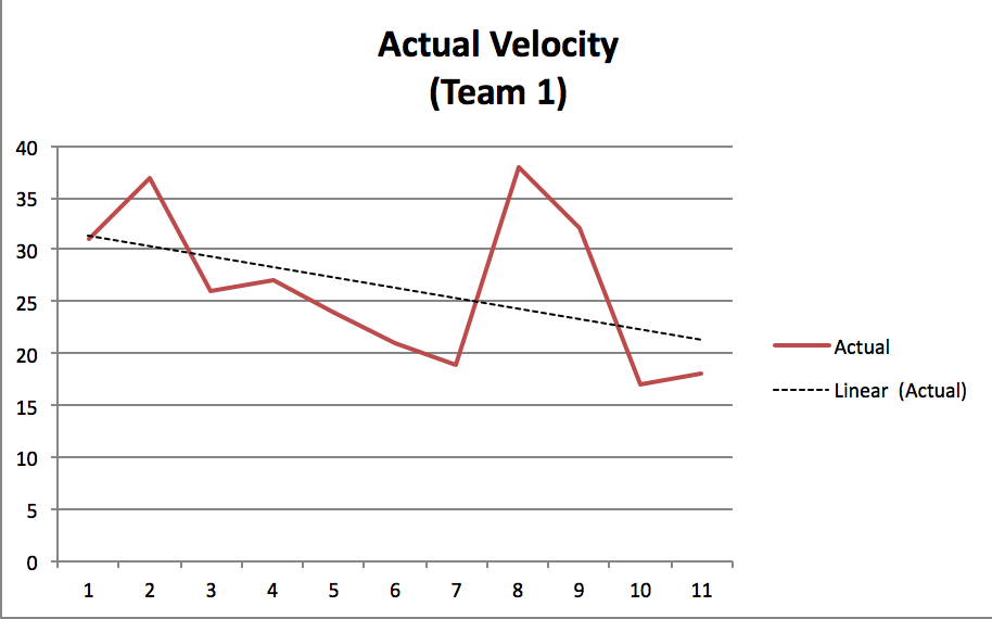
Its also shows velocity trend over time:
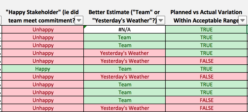
In addition the spreadsheet shows:
- “Yesterday's Weather” is the approach that most agile teams use to determine how much they think they can get do in this sprint. The idea here is that the best predictor for the weather today is whatever happened yesterday. This thinking can be applied to Sprints. How much work should we commit to in this Sprint. At least you have the data point with yesterday (actual data) whereas anything else is a guess.
- “Happy Stakeholder” is the viewpoint of some external person (manager, other stakeholder) who is looking at a sprint by sprint view of team making and meeting commitments. The idea is to get into the habit of making and meeting commitments so that stakeholders can feel good about what they are getting. The calculation is set up so that if we deliver more that expected, stakeholders will be happy. Again, this leads to a discussion about whether we would we have been better off using yesterdays weather as guess or the guess we have
- “Velocity Variation” is the comparison between early sprints and later sprints in terms of velocity. The idea is to discuss whether we are getting better. Please note that this is a very bad public benchmark as it can be easily gamed.
Files
/home/hpsamios/hanssamios.com/dokuwiki/data/pages/how_should_we_initially_track_multiple_teams_progress.txt · Last modified: by hans