Table of Contents
Troy Magennis - Data Driven Coaching
Team data and dashboards can be misused and cause more pain than results. Having the team run blind to its historical data though is often worse, with solely opinions and gut-feel driving process change. Helping your teams see and understand a holistic balance of their data will give your coaching advice context and encourage team constant improvement through experiments and reflection. Coaching dashboards are about balancing trade-offs. Trading something your team is great at for something they want (or need) to improve. Having the team complete the feedback loop and confirm than an experiment had the intended impact, will process improvement be continuous and sustainable.
This session shows how to expose data to teams in order for them to retrospect productively, determine if a process experiment is panning out as expected, and to vigorously explore process change opportunities. Recent research shows strong relationships of certain metrics to process and practices, and this session demonstrates how these metrics have and can be tied to timely coaching advice.
The real-world dashboards demonstrated in this session show most common problems and how to avoid them with before and after shots and quotes from the teams impacted by them. In this session you will – Learn how you can not only gather data, but use it to improve the process, with examples! Learn how your can tie data insights to coaching advice (data driven coaching) Learn how you can detect, predict and avoid data gaming and dashboard misuse Learn from my mistakes, and mistakes I’ve seen others with real examples of Agile coaching dashboards (good and bad) Learning Outcomes: How to reliably expose team data for process improvement How to tie data to coaching advice (data driven coaching) How to avoiding data gaming and dashboard misuse Real examples of Agile coaching dashboards (good and bad)
Summary
- Content rating (0-no new ideas, 5 - a new ideas/approach, 9-new ideas): 7
- Style rating (0-average presentstion, 5 - my level, 9-I learned something about presenting): 5
Action / Learning
- Quote “Make a difference, not a point” - Troy
- See Windyty.com
- Quote “Never show data unless you show it compared to something else” - Edward tufte
- Quote “If anyone adjusts a stable process , the output that follows will be worse than he had left the process alone” - Deming. You can do more harm than good. Don't panic
- Check out Leankit
- Checkout Jumpplot.com
- See Bit.ly/ThroughPut
- Capability matrix - management job
- Bring in the quadrant thinking for retro - start date, end date, and type
- Find out about tableaux (product to visualize data?)
- See paper bit.ly/14eYFM2 - need to understand this better
Presentation
Presentation at: https://submissions.agilealliance.org/attachments/2394
My copy: data_driven_coaching_-_agile_2016_troy_magennis_.pdf
Also
- To understand what you can do with start and stop date (cycle time graphs): http://bit.ly/Throughput
- To understand a way to develop people - capabilities matrix: http://bit.ly/CapabilityMatrix
Notes
See duck / rabbit slide See something different
Metrics - watch for the behavior that you don't expect
People worry about being blamed / judge Don't embarrass - this results in poor data
Make a difference, not a point Only do it when you know you can make a difference
Use data to tell a story What to do next Not talking about the past This is a recording of the past
Without a story, data is boring
Windyty.com
Why do good charts work Answers - compared to what, compared to me (as long as I am driving when I see it) About trends
“Never show data unless you show it compared to something else” - Edward tufte
Ok want personal information But allow someone to select themselves
Makeover chart
Crowd sourcing stories - Twitter
What questions do we ask And then work on “compare to what”
“If anyone adjusts a stable process , the output that follows will be worse than he had left the process alone” - Deming You can do more harm than good Don't panic
For visualization work need to do as group See things differently Want to make sure people are seeing the same
Allow people to drill down into detail Explore their own data during retros etc Navigation metaphor
Jumpplot.com Height of curve is cycle time Under line is “going back”
It's too hard and we don't have the data
What could I do with just start and complete date Bit.ly/ThroughPut
MVP
Mvp vs win championship 24%
Capability matrix Ready to learn, doers, can teach other Rather quit, maybe willing to learn, yes willing to learn
Use this to build a bench Skill deficit
Managers job is to grow people
Print it out, Fill it out, don't put your name on it Anonymous gives better data
Find balance Help teams understand trade offs Think ahead Ready for future
Coaches job is to find balance Measure 4 things Quality, responsiveness, productivity, predictability - Larry macherone Have at least at one measure per quadrant Normalize by team size
Always show the four metrics together As working trade offs
Team only view of data?
Cannot be excellent in all four levels
It's about the team Divide by team size Divide by average (helps normalize for SD)
Quality If our entire did nothing else but fix bugs at our historical rate we would have X days of work Goal to keep within 10 days (or else we help you)
Compare your teams with other teams Your team highlight / rest dark No vertical axis as not important Then took away messy lines and just put in company average Allows people to see Trade some throughput to improve defect or predictability, for example
Change coaching advise See panel
Given shape of curve is there is coaching advice we can make
See paper bit.ly/14eYFM2
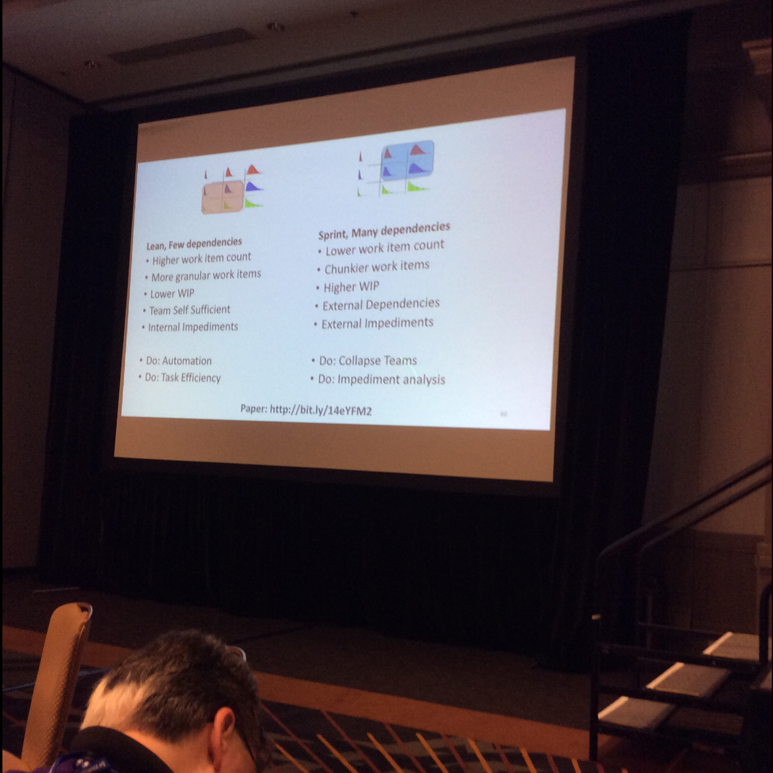
Message - stop telling people what they can't do Need to understand this better